As our video didn't have a proper narrative therefor we went for something that caught the audiences eye by the use of camera shots. The video kickstart by Example influenced our group because of the use of editing, split screen, camera shots etc, this is why we used it in our video. Also the genre of both videos are a mixture of indie and pop.
'kickstart' by example

This shot here from our video is our main chorus. So we split the screen in two.

Here you can see a screenshot of a split screen from the kickstart video and the way it shows visual links between our video.

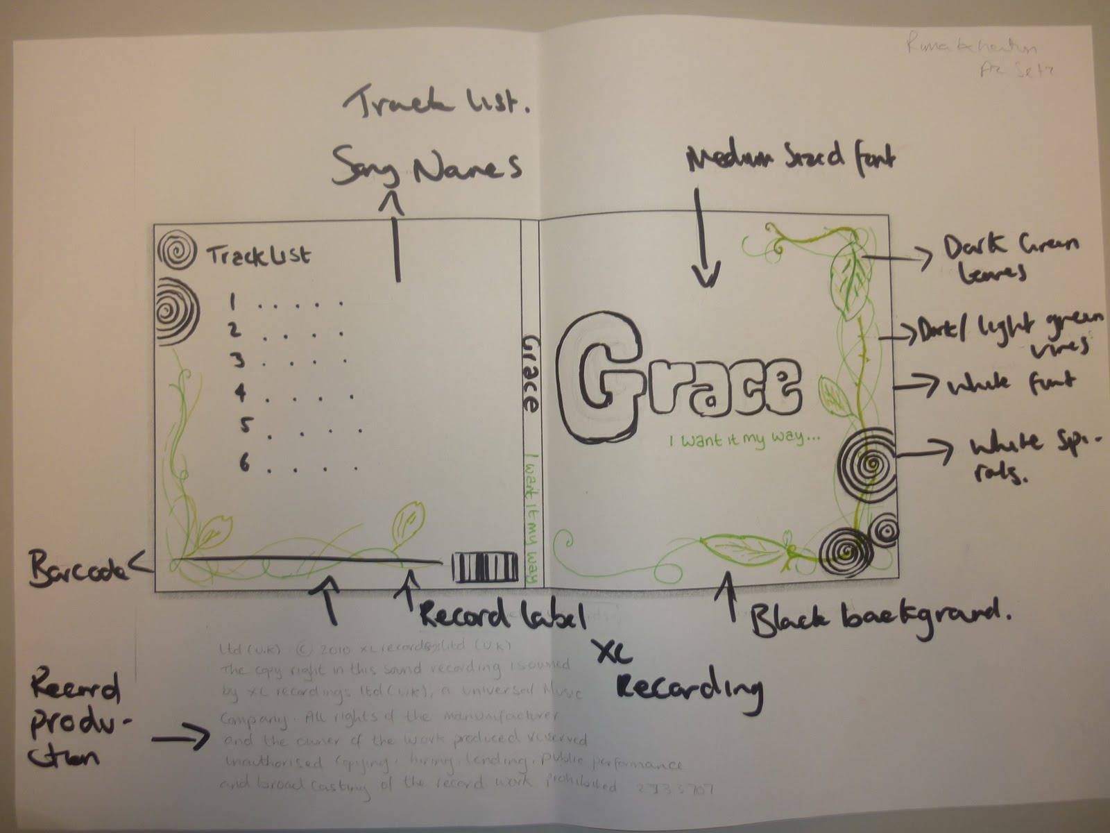
My digipak was influenced by Au Revoir Simone's digipak cover.
I like the use of simple flat colours used on this digipak as it doesn't have too much going on and is easy to notice. The background colour is just plain blue however effect is very effective as it looks like some source of light being reflected. You can only see two simple text on the title and the track list on the back. The tree on the front is the biggest clue on what genre the music is going to be, you can tell instantly it is indie.

This is a picture of the inside left panel of my digipak.
I decided to go for a graphic style rather than using pictures from our video because i wanted to do something different as most digipaks uses pictures from music videos.


My advertisement was influenced by Au revoir Simone's poster as well as jack johnson's in between poster. I really like the use of designs and effects used on these posters as it catches the audiences eye with out having to show too many colours and pictures.

This is my advertisement and as one can see that i have used the main convention of an advertisement in which in this case is showing a picture of the front cover of my digipak so it isn't hard for the audience to realise which music video this advertisement is referring to.
i have used graphical patterns of leaves and spirals relating to advertisements i have seen that relate to the genre indie. I tried to keep everything straight forward and simple. I also used only two different fonts and colours.
2) How effective is the combination of your main product (video0)and ancillary textss (digipak and advertisement)?
As my digipak doesn't have pictures it would be quite hard for my audience to recognise the music video however instead of creating visual links with pictures i instead did it with graphic designs to show something different and because the genre of my music video is indie pop, most digipaks and advertisements do not show the artist on the front and even if they do they are shown looking away from the camera as they don't really like making eye contact with the audience.

This is a picture of my design from my digipak

This is a shot from the chorus of my music video


These are the designs that influenced me into using leaves and filter effects on my digipak and advertisement.

This is a picture of my design from my advertisement.
I used leaves and spiral effect vines to create a visual link between my video and my ancillary products.
I think my ancillary products are quite successful as it does attract the audience and does give away the main concept of what genre the music video is from however, it is not easy to tell which music video the products are linked to.
3) How did you use media technologies in the construction and research and planning and evaluation stages?


Video cameras used for filming and digital camera used for taking pictures
We used a light that connected on top of the video camera because there was a scene in our video where the male artist was singing and the background was dark. we used a range of shots like close ups, medium shots tracking, panning etc. we took picture before filming to help us decide what we would shoot and where are location would be.


here are some pictures we took while filming the first three are of when we were doing the panning shot of the sky.

This is a low angle shot from our music video as one can see the artist is looking up at the camera.
This shot is effective as it is shown from a different perspective rather than having same angles all the time


these shots are from the beginning and end of my music video and and it pans around showing the view of a sky
By adding a dark effect on the last shot of the sky tells the audience the video has finished
Blogger used for researching other music video that links to our genre and many more, planning designs and ideas for music video and ancillary products and evaluating our final outcome.
.jpeg)
youtube used for searching music videos to compare to and embedding and also to show links.
internet explorer and firefox used for searching pictures and digipaks and advertisements.

final cut pro used for editing the music video. fast/slow edits adding effects to particular shots.

split screen effect into nine squares this is because we wanted to do something different to other videos.

filter used on top of one shot to show other shot through it as it tells the audience what is going to happen next.

this shot is speeded up so it doesn't seem the videos going on forever.
photoshop used to create the digipak and advertisement
many different layers used to show designs.


many different layers used to show designs.
final outcome of ancillary products
animatic storyboard
a draft of our video showing the basic shots and effects, pictures going to be used before the finished outcome

editing screen on final cut pro

Here is a screen shot of how i was changing the effects on the titles and backgrounds on photoshop

here is a screen shot of when i was a adding a filter effect to my background

researching on blogger
analysing digipaks that relate to our genre

planning on blogger
planning my digipak and advertisement showing what fonts and background colours are going to be used.

evaluating on blogger
4) What have you leaned from your audience feedback?
http://vimeo.com/17676727
LINK TO OUR VIDEO
while viewing my video at cinema the audience were very amused as they thought it was something different to what others have created.
they were very fond of the use of filters and effects.
while analysing in class some of the feedback we got were:
good range of shots
lighting was quite dark
speeding some parts up tied the video in together
video should be extended
The improvements that i thought should be made is making the film a little longer and maybe if we had a narrative to it would of made it more interesting.
i enjoyed filming mostly as it made me realise how difficult it is to get the camera in the right position and how to get the specific shots. Editing was really interesting as it was very confusing as to how filming for many hours all came down to a two minute video and how it all should be layed out.
creating the ancillary products was really fun as it taught me how to put different layers and filters to make it effective.
I have learnt throughout the preparation of making a music video and ancillary products that a successful music video will make clear links between it and its ancillary products, digipak and advertisement.
Overall i have enjoyed this whole project and hope to carry on creating more.