Fonts
Before chosing my font i went through a range of fonts to decided which was most suited for my genre. My genre was indie so from previous research review other indie digipak and advertisements i notice that there was a pattern of font styles. The pattern that i saw was that all the indie artists chose a font that was simple but also has a egde of style to it. After going through all the fonts i was looking at two particuar styles; Apple Chancery and Algerian. These two fonts suited my genre and had that essents of style that i was looking for to suit my artist. After much thought i decided to chose Apple Chancery as the main font i was going to use. I liked this font because it was simple and had an edgy style.
Layout
After looking at many different digipaks, i decided that i would create a four panel digipak. My reason for this was because my genre is indie and the style that indie artistschose is to keep it simply and focus moreon the music rather than themselves as an artist. I decided to have an image on my digipak that was from my video. I chose to do this because from the reasearch i gathered on artist's digipaks, most of them chose to have an image from their video as their digipak cover.
Colours
The colours that i am planning to use are earthy colours such as blue, grey, white, green and orange. I decided to use colours that were already exsisting in my video. I feel that i should use natural colours and colours that are light.
Design Ideas
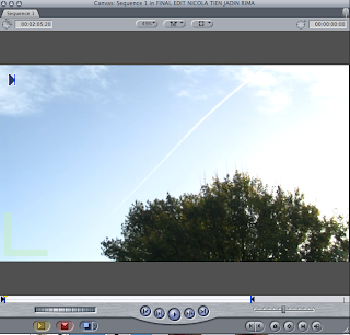
I like this image as it is simple and plain,however, i think the colours i am going to use for the fonts will contrasts nicely with the background image. Also, this is an image from my video so it will link my artist to my digipak.

No comments:
Post a Comment